
Brand Identity and Graphic Design for Modern Businesses: A Complete Guide
A strong business identity is more than a logo; brand identity and graphic design translate strategy into a consistent, recognizable experience across customer touchpoints.
Summary
This guide defines the difference between brand strategy, identity, visual identity, and graphic design; explains the essential elements; and shows how to build a flexible system, test it across digital and print channels, choose a designer, protect assets, and measure consistency without relying on guesswork.
What brand identity and graphic design mean
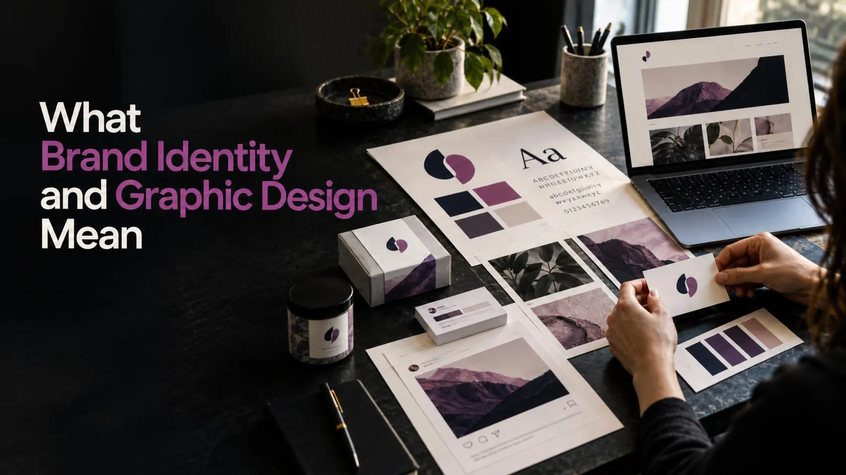
A brand is the meaning people attach to a business through its products, service, reputation, communication, and customer experience. Brand identity is the set of choices a business makes to express what it stands for. Those choices can include its name, values, personality, messages, logo, colours, typography, imagery, and design rules.
Adobe explains that visual identity is a key part of brand identity, including elements such as logos, colours, typography, imagery, and consistent design systems.
Source: https://www.adobe.com/
Graphic design turns parts of that identity into clear visual communication. It shapes how a business presents an offer on a website, packaging, an advertisement, a presentation, or a social post. The design should help people understand the message and recognize who is speaking.
These related terms describe different things:
| Term | What it means | Example |
|---|---|---|
| Brand strategy | The decisions that guide how a business serves and differs from its audience | Positioning, audience, value proposition |
| Brand identity | The complete system a business uses to express itself | Name, personality, voice, visual system |
| Visual identity | The visual part of brand identity | Logo, colours, type, imagery, graphic elements |
| Graphic design | The practice of arranging visual elements to communicate | Website banner, brochure, product label |
| Brand image | The audience’s actual perception of the business | The ideas and feelings customers associate with it |
Adobe similarly presents visual identity as one part of a broader brand identity, supported by rules that help teams use visual elements consistently.
A logo matters, but it cannot carry every brand message on its own. Strong brand identity and graphic design connect the logo to a wider system: how the business sounds, what its imagery looks like, how its layouts work, and what customers should expect at each stage.
Why they work better together
A business can have a polished logo and still look inconsistent if its website, ads, invoices, packaging, and social media use unrelated visual styles. A connected system gives customers repeated cues. Over time, these cues can make it easier to recognize the business and understand what it offers.
A useful system supports five practical business needs:
- Recognition: Repeated use of a distinct logo, colour palette, type style, and image direction helps people identify the business across channels.
- Clarity: Visual hierarchy directs attention to the most useful information: the offer, benefit, proof, and next step.
- Trust: Consistent presentation makes a business feel considered. The design cannot prove that a company will deliver well, but it can make its communication more coherent.
- Differentiation: A business can show how it differs through its visual decisions, message, service promise, and customer experience.
- Efficiency: Reusable design rules and templates help teams create new materials without reinventing the style each time.
Brand identity and graphic design should reflect the way a business actually operates. A premium appearance cannot compensate for confusing service, inaccurate claims, or poor support. The visual system should make the real customer promise easier to see and remember.
Core elements of a useful brand identity system
1. Brand foundation
Before selecting colours or sketching logos, define the business. Write down its purpose, audience, offer, differentiators, values, and personality. Keep the answers concrete.
Instead of “we are innovative,” explain what the business helps a customer do differently. Instead of “we serve everyone,” identify the people most likely to benefit from the offer and why they choose it.
A concise foundation might include:
- Audience: Who needs the product or service?
- Need: What problem or goal brings that audience to the business?
- Promise: What outcome can the business credibly offer?
- Difference: What makes the offer distinct from alternatives?
- Personality: What should the business feel like: practical, warm, technical, playful, or formal?
- Proof: What evidence supports the promise?
2. Logo system
A logo identifies the business. It might be a wordmark, symbol, monogram, or combination mark. A practical identity often needs more than one approved version:
- Primary logo for the main brand presentation
- Compact or secondary logo for narrow spaces
- Symbol-only version for an avatar, app icon, or favicon
- Light and dark versions for different backgrounds
- One-colour version for simple print applications
Test each version at actual sizes. A mark that looks detailed on a large screen may become illegible as a small profile image. Check that shapes remain distinct in black and white and that the logo still works without a decorative background.
3. Colour palette
Choose colours based on the brand’s audience, positioning, practical uses, and contrast needs. Colour associations vary by context and culture, so do not treat colour psychology as a fixed formula. Test colour combinations with real text, buttons, charts, packaging, and photos.
Document each colour with its name and values for the channels where it will appear. A palette can include:
- Primary brand colours
- Supporting colours
- Neutral background and text colours
- Accent colours for calls to action or key information
- Approved combinations and combinations to avoid
For normal-sized text, WCAG 2.2 Level AA calls for at least a 4.5:1 contrast ratio; large text has a 3:1 minimum. Check text and interface states with a contrast checker, especially when using light accent colours on white or pale backgrounds.
4. Typography
Typography affects readability and tone. Choose a small set of typefaces that support the business across web, print, and office documents. Define which font is used for headings, body text, labels, and occasional emphasis.
Test type choices in long paragraphs, short mobile headings, buttons, and numbers. A font can look distinctive in a logo but become tiring in body copy. Confirm licensing and available weights before adopting a typeface across the company.
5. Photography, illustration, and graphic elements
Set a visual direction for photography, illustration, icon style, shapes, patterns, and backgrounds. These elements add meaning beyond the logo. For example, an outdoor brand might use natural light and real locations; a software company might use interface-led visuals and precise diagrams.
A graphic design artwork system should specify practical details such as:
- Photography subject, lighting, crop, and editing style
- Illustration detail, line weight, and colour treatment
- Icon stroke and corner style
- Patterns, borders, shapes, and textures
- How to use screenshots, product images, and customer photos
6. Voice and messaging
Visuals cannot create a complete identity on their own. Define the business’s writing style alongside its graphics. Is the brand direct or conversational? Does it use technical language or explain terms simply? How does it handle questions, complaints, and claims?
A consistent voice helps social posts, website pages, proposals, and customer emails feel connected. It also reduces the risk that a polished visual promises something the written content cannot support.
7. Brand guidelines and reusable templates
Brand guidelines explain how the team should apply identity elements. They can be short if they answer the questions people actually face. Include approved logo files, colour values, font rules, image direction, layout examples, accessibility notes, and contact details for the person who maintains the files.
Templates can help staff make routine materials faster. Provide editable templates for the formats the business uses most, such as presentations, social posts, proposals, and email banners. Keep a clear approval process so teams can adapt content without gradually changing the identity.
A step-by-step process for building the system
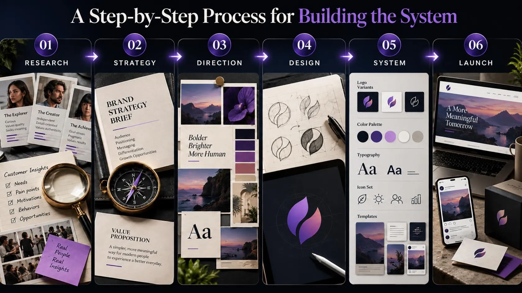
A good process starts with business questions and ends with tested assets. This keeps brand identity and graphic design tied to customer needs instead of personal taste alone.
Step 1: Audit what already exists
Collect the current website, social profiles, ads, brochures, packaging, documents, and customer-facing emails. Review them side by side. Record where the brand looks consistent and where elements conflict.
Ask customers and staff what they recognize first, what they find confusing, and what they believe the business offers. Their answers may expose a gap between the intended brand and the one people actually experience.
Step 2: Research customers and competitors
Review competitors to understand common category conventions and visual gaps. The goal is not to copy the market leader. Look for design patterns customers already understand, then identify where your business can be distinctive without making the offer harder to recognize.
Gather information from customer interviews, support questions, sales conversations, analytics, reviews, and search queries. Separate direct evidence from assumptions. If a business has little customer data, label early choices as hypotheses and plan to test them.
Step 3: Write the positioning and creative brief
Summarize the work in a one-page brief. Include the target audience, customer problem, business promise, differentiators, brand personality, practical requirements, competing references, and success criteria.
A clear creative brief might say: “Help small ecommerce teams understand that our service makes product content easier to manage. The identity should feel capable, straightforward, and modern. It must work in the web app, WordPress admin menu, social profile, and sales presentation.”
This level of detail gives the designer a useful decision framework. It also helps stakeholders explain why one direction fits better than another.
Step 4: Explore visual directions
Create a small set of distinct visual routes. Each route should connect to the brief and explain its choices. A moodboard can help teams compare colour, type, imagery, and layout before they approve a logo.
Avoid asking only, “Which one do you like?” Ask which direction best communicates the offer, feels credible to the audience, works at small sizes, and can support future products. Collect feedback from decision-makers early to avoid last-minute reversals.
Step 5: Design and test the logo system
Develop the logo after the foundation and visual direction are clear. Test it on real backgrounds and real applications: a website header, mobile avatar, printed label, invoice, and monochrome document.
Adobe notes that vector shapes let designers create logos for use on screen and in print. A vector master file can scale without the pixelation associated with enlarging a small raster image. Keep the editable master and export formats suited to the actual applications.
Step 6: Build the supporting visual system
Create the colour palette, typography rules, image direction, graphic elements, layouts, and key templates. Check that the system supports both campaign work and everyday communication.
This is where brand identity and graphic design become a practical operating tool. If a new social post requires a designer to guess the font, image treatment, spacing, and logo version, the system needs clearer guidance.
Step 7: Document, hand off, and protect assets
Organize files in a shared location and label them clearly. A common delivery package may include:
- Editable vector master, such as AI or EPS
- SVG for appropriate web applications
- PNG with transparent background for general digital use
- PDF for review and print handoff
- JPG for applications that need a flattened image
- Colour and typography specifications
- Brand guideline document and approved templates
Ask the designer to explain what rights, licenses, source files, font usage, stock assets, and modifications the client receives. Keep a record of the agreement. Businesses can learn about trademark protection from official trademark resources such as the USPTO trademark guidelines, so check the relevant official guidance and consult a qualified professional where needed. The USPTO trademark basics explain how trademarks can identify and distinguish goods or services in the United States; businesses operating elsewhere should check their own jurisdiction.
Step 8: Launch in stages and review
Prepare the highest-visibility assets first: website, social profiles, email signature, sales materials, packaging, and signage. Set a launch date and assign owners for updating each channel.
After launch, review real applications. Check mobile pages, browser tabs, dark backgrounds, print proofs, and common screen sizes. Ask customers whether they understand the offer and recognize the business. Refine weak points without changing every element at once.
Applying the identity across web, print, and campaigns
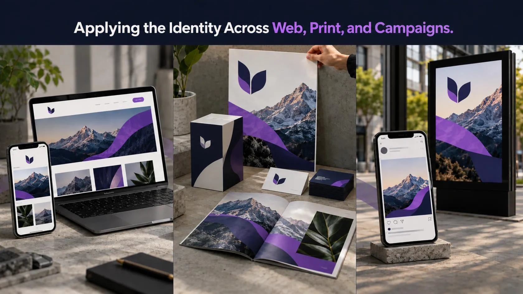
A brand can use different layouts on different platforms while keeping the same identity. The website may need an uncluttered logo and readable navigation; packaging may need bold graphics that remain visible from a distance; social posts may need a flexible template for changing copy and imagery.
That distinction matters in graphic design and web design. Graphic design shapes individual visuals and layouts; web design also has to account for navigation, responsive behaviour, page hierarchy, accessibility, and user tasks. Both disciplines should work from the same identity rules.
Adapt the system to the application:
- Website: Use legible type, consistent buttons, clear page hierarchy, accessible colour contrast, and properly sized logo assets.
- Social media: Define avatar, cover, post, story, and video-thumbnail rules. Keep important text readable on a phone.
- Advertising: Connect each creative to one audience, one offer, and one action. Preserve enough brand cues for recognition while testing headline and layout variations.
- Email: Use consistent sender details, heading styles, links, and a restrained signature.
- Packaging and print: Check material, print method, colour reproduction, bleed, and small-text legibility with the production vendor.
- Presentations and proposals: Use reusable type, chart, image, and title-slide rules so sales materials feel like part of the same business.
For related implementation, visit the GrowthAxis Solutions service overview and explore Brand Identity Design, Graphic Design, UI/UX Design, Website Development, and SEO Services. When those services have separate page URLs, link each topic directly to its matching page. Google recommends descriptive anchor text that helps people and search engines understand the destination.
Choosing a designer or agency
A graphic design artist may focus on visual concepts and artwork; a graphic web designer may combine brand visuals with website layouts. Some designers cover both areas, while others work with a developer or brand strategist. Decide what expertise the project actually needs before comparing proposals.
If you are looking for graphic designer support, review portfolios for relevant problems and outcomes, not just attractive mockups. Ask how the designer researches audiences, presents concepts, handles revisions, prepares files, and documents usage. A graphic design artist should be able to explain the reasoning behind a visual choice in terms of the brief.
Ask prospective providers:
- What research or discovery is included?
- How many distinct design routes and revision rounds are included?
- Will the project include a complete logo system or a single logo file?
- Will guidelines, templates, and source files be included?
- Who owns the final work, and what third-party licenses apply?
- How will the work be checked across web, mobile, and print?
- What information or approvals does the business need to supply?
An experienced a graphic designer can help turn business goals into practical visual decisions, but the business must provide accurate information and make timely decisions. If the project includes website layouts, confirm who handles responsive design, development, accessibility checks, and content. Do not assume a logo package includes a complete website or full brand strategy.
A search for professional logo design services may return anything from a single logo to a multi-part identity engagement. Compare scope before comparing price. A lower fee may cover fewer deliverables; a higher fee may include research, workshops, multiple applications, brand guidelines, and handoff support. Ask for a written scope and avoid paying for work the business does not need.
The phrase Adobe Illustrator graphic design often points people toward vector-based logo and illustration work. The software can support production, but the tool does not guarantee strategic quality. Evaluate the designer’s thinking, craft, file preparation, and ability to make the identity work in context.
Measuring whether the identity works
Brand design can support business goals, but a visual refresh does not guarantee revenue or ranking improvements. Define the intended outcome before launch, establish a baseline, and measure changes in a way that matches the goal.
A practical review can track four areas:
| Area | What to review | Possible method |
|---|---|---|
| Recognition | Can people identify the business or its materials? | Short customer survey or unaided recall question |
| Clarity | Can people explain the offer and next step? | Customer interviews, usability tests, enquiry quality |
| Consistency | Do key touchpoints follow the approved system? | Asset audit with a simple checklist |
| Performance | Do campaigns and pages help users act? | Analytics, conversion tracking, qualified leads |
A simple internal consistency audit can score each asset against a checklist:
- Correct logo version
- Approved colours and typefaces
- On-brand imagery and graphic style
- Clear message hierarchy
- Readable text and accessible contrast
- Correct link, CTA, and contact information
Record the result, note the repeated problems, and fix the patterns first. If a campaign underperforms, test one or two design variables at a time—such as image style or headline hierarchy—while keeping the audience and offer stable. That makes it easier to learn what helped.
When reviewing search performance, keep content quality and page experience in view. Google says its systems aim to prioritize helpful, reliable, people-first content; it also notes that E-E-A-T is not itself a specific ranking factor. Use the Google people-first content guidance as a quality reference, not as a promise of rankings.
Illustrative example: bringing a small business into focus
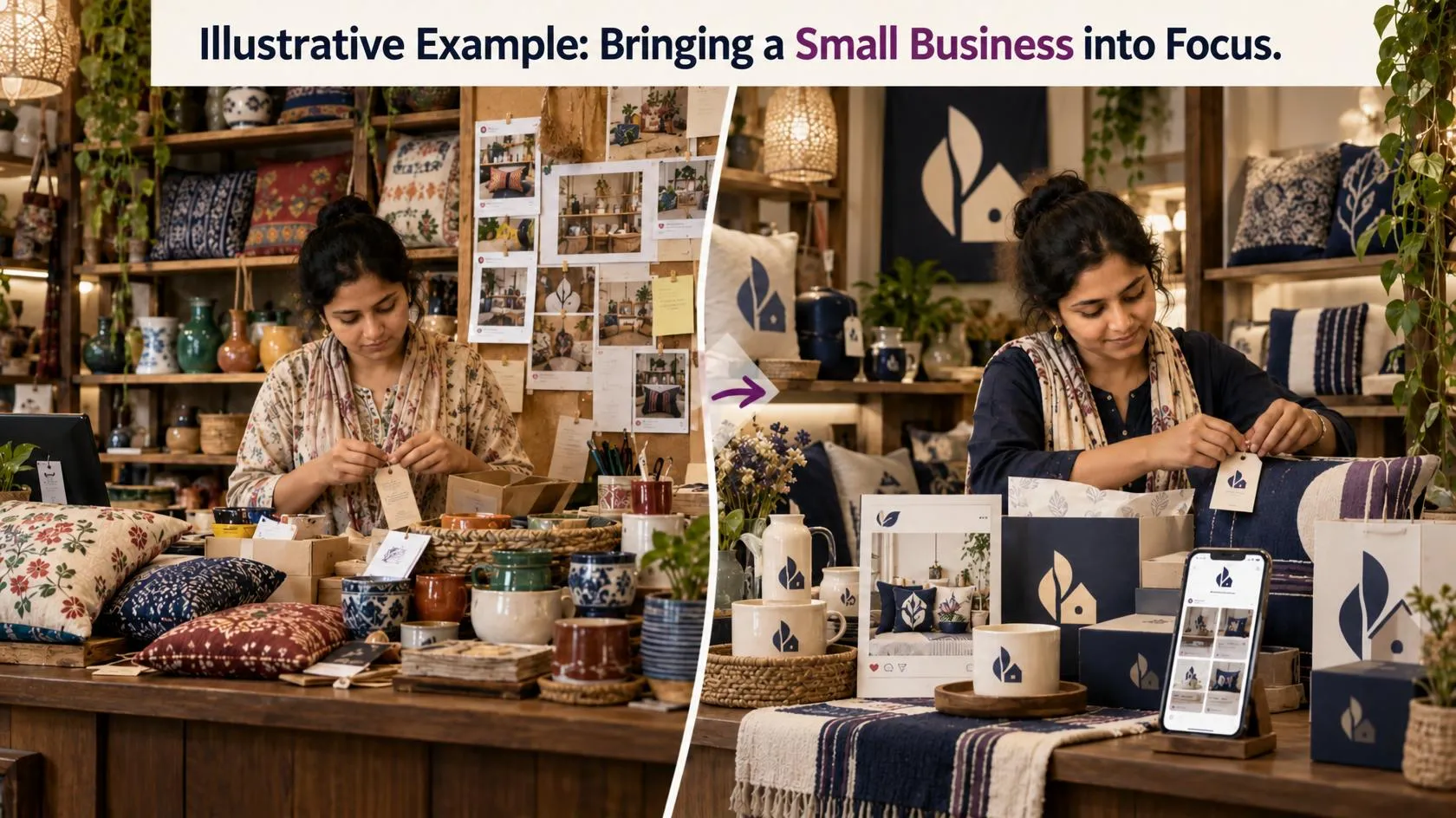
Consider a fictional Dhaka-based home décor shop that uses one logo on Facebook, another on invoices, and a third colour scheme on its website. Customers like its handmade products but often ask whether the shop sells premium imported items or locally made products.
The shop begins by reviewing customer questions, product photos, and sales messages. It decides to communicate three points: locally made, carefully finished, and easy to order. The team then defines a warmer image style, a restrained colour palette, legible typography, and a logo system that works on product labels and profile images.
The new identity also includes a product photography guide, social templates, invoice design, and short wording rules for describing materials and delivery. The shop tracks customer questions, website product-page engagement, and sales enquiries before and after rollout. It does not assume the redesign caused any change by itself; it checks the data alongside stock, pricing, campaign activity, and seasonality.
This example shows how brand identity and graphic design can help a business express a real difference more clearly. The system connects the message to the daily materials customers see and the questions they ask.
Common mistakes to avoid
- Starting with a logo before the strategy. The logo then has to carry unclear or conflicting ideas. Define the audience and promise first.
- Copying a competitor’s look. Familiar category cues can help users understand an offer, but copying can make the business less distinctive and create legal risk.
- Choosing colours by personal preference alone. Check readability, context, audience expectations, and how the colours reproduce across devices and materials.
- Using too many fonts and visual styles. A large collection of styles makes each new asset harder to control. Choose a small, flexible set.
- Treating mockups as final files. A logo on a glossy mockup can conceal poor small-size performance. Request real-use exports and test them directly.
- Skipping guidelines and file organization. Staff and vendors may improvise if the approved assets are difficult to find.
- Making an abrupt rebrand without a transition plan. Update high-visibility materials together and explain major changes when existing customers may not recognize the new presentation.
- Ignoring accessibility. Low contrast, tiny text, and image-only content can make information hard to access. Use readable typography, contrast checks, alt text, and clear page structure.
- Assuming a new identity will fix a weak offer. Design can explain the offer more clearly; it cannot replace product quality, reliable service, or credible claims.
- Changing too many variables during testing. If the audience, offer, message, and visual design all change at once, the business cannot tell which change affected the result.
Pro tips for a brand system that lasts
- Design for real use cases. List the places where the identity will appear before creating the final logo package.
- Create one source of truth. Store approved files, fonts, colour values, and templates in a location staff can access.
- Keep editable masters. Preserve working files and note which formats are intended for print, web, or everyday use.
- Check brand use at small sizes. Test favicons, profile images, navigation bars, and mobile screens before approving details.
- Set a review owner. Assign someone to update guidelines and retire outdated files when the identity changes.
- Use AI tools carefully. They can support exploration and production, but review originality, accuracy, licensing, privacy, and output quality before commercial use.
- Keep a change log. Record what changed and why. That makes future updates more consistent and easier to evaluate.
- Build a simple content library. Store approved photos, icons, layouts, and campaign examples so teams can create on-brand materials faster.
The strongest brand identity and graphic design systems balance consistency with useful flexibility. They give teams clear rules while still allowing the business to create content for new products, audiences, and channels.
Conclusion
A useful identity system connects a business’s audience, promise, visual choices, and customer experience. Brand identity and graphic design work best when strategy guides the logo, colour, typography, imagery, and templates across every channel. Start with a clear brief, test assets in real contexts, and measure what changes. For support, explore the GrowthAxis Solutions service overview.
Frequently Asked Questions
1. What is the difference between brand identity and graphic design?
Brand identity is the broader system a business uses to express what it stands for, including its personality, voice, visual elements, and guidelines. Graphic design is the practice of arranging visual elements to communicate a message. Graphic design can express the visual parts of brand identity through logos, websites, ads, packaging, and other materials.
2. Why does a business need more than a logo?
A logo identifies the business, but it cannot define every colour, font, photo style, layout, message, or customer interaction. A complete identity system helps teams present the business consistently across its website, social media, packaging, advertising, and documents. It also gives designers and staff practical rules for creating new materials.
3. What should a brand identity package include?
A package may include primary and alternate logo versions, a symbol-only mark, colour specifications, typography rules, image and graphic direction, brand guidelines, and reusable templates. It should also include file formats suited to print and digital use, plus an agreement explaining source files, usage rights, and third-party licenses. The exact scope should match the business’s needs.
4. How do I choose colours for a brand?
Begin with the audience, market, product, brand personality, and practical requirements. Review competitor colours to understand category patterns, then choose combinations that help the business stand out without harming readability. Test the palette on websites, mobile screens, print samples, buttons, and photos. Use contrast tools to check text and interface elements.
5. Can a small business create its own brand identity?
Yes. A small business can define its audience, promise, voice, colour palette, typography, and basic templates in-house. It should still test the system across actual applications and document the rules. A designer can help when the business needs distinctive logo development, broader strategy, multiple deliverables, or production-ready assets.
6. What files should I request from a logo designer?
Request an editable vector master, appropriate SVG and PNG exports, print-ready PDF, and a one-colour version. You may also need a JPG for simple applications. Ask which files work for your vendors and platforms, whether source files are included, and what rights apply. Keep approved files clearly labeled so staff do not reuse outdated exports.
7. How do brand identity and web design connect?
The website is one of the most important places where visitors experience a brand. Its colours, typography, imagery, and tone should reflect the identity, while navigation and page layout should help visitors complete tasks. A coordinated team connects visual identity with responsive design, accessibility, clear content, and reliable performance.
8. How often should a business update its brand identity?
Review the identity when the business changes its audience, offer, market position, name, or major customer experience. Do not redesign only because a style feels old. First identify the problem, check what customers recognize, and decide whether the business needs a small refresh or a deeper rebrand. Keep familiar assets when they still support recognition.
9. How can I tell whether my brand design is working?
Set a goal before launch. To check recognition, ask customers what brand they associate with a sample asset. To check clarity, ask them to explain the offer and next step. To check consistency, audit live materials against the guidelines. For campaign outcomes, review analytics and qualified enquiries while accounting for other changes that may affect results.
10. How can I find the right designer for my business?
Look for a portfolio that demonstrates relevant problem-solving, not just attractive mockups. Ask about research, concept development, revision rounds, file delivery, accessibility, source files, and usage rights. Confirm whether the designer handles strategy, web design, or only graphic production. Compare written scopes so you know what the fee includes.